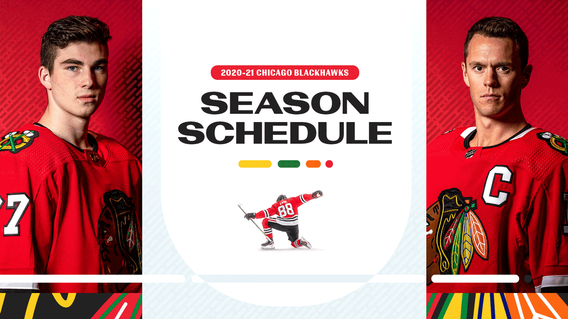
AN ODE TO TRUE AND SPIRITED BEGINNINGS
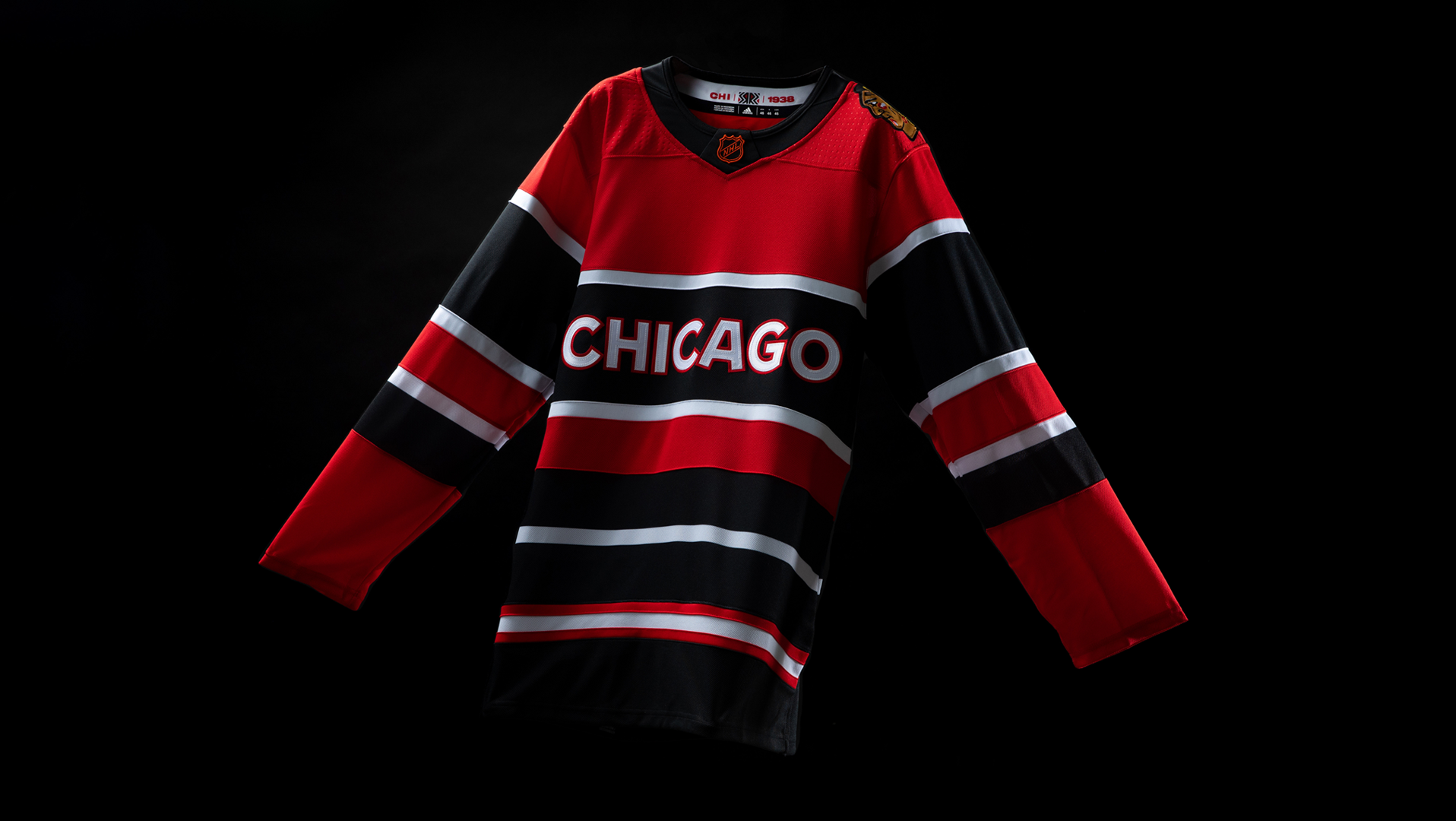
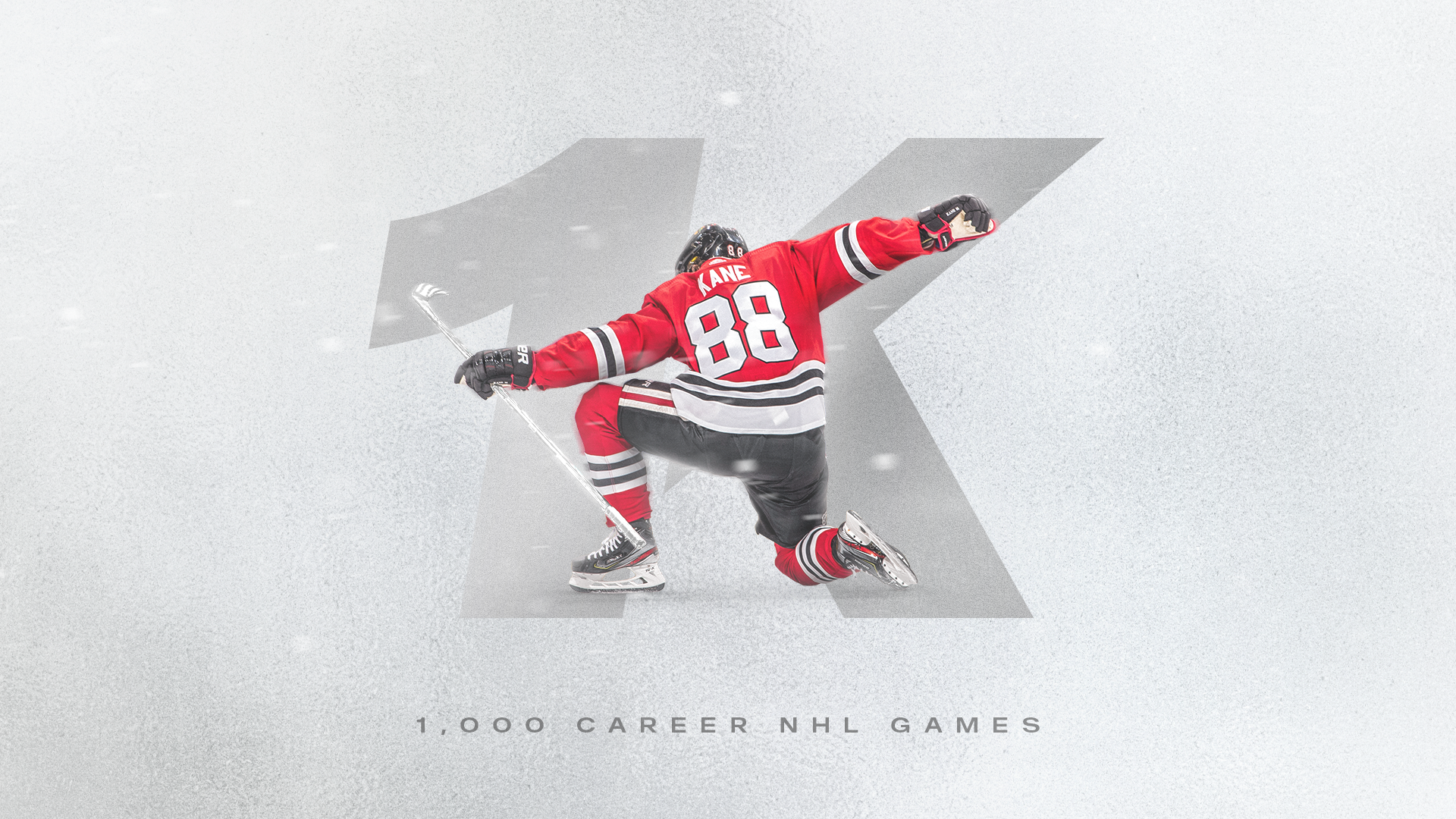
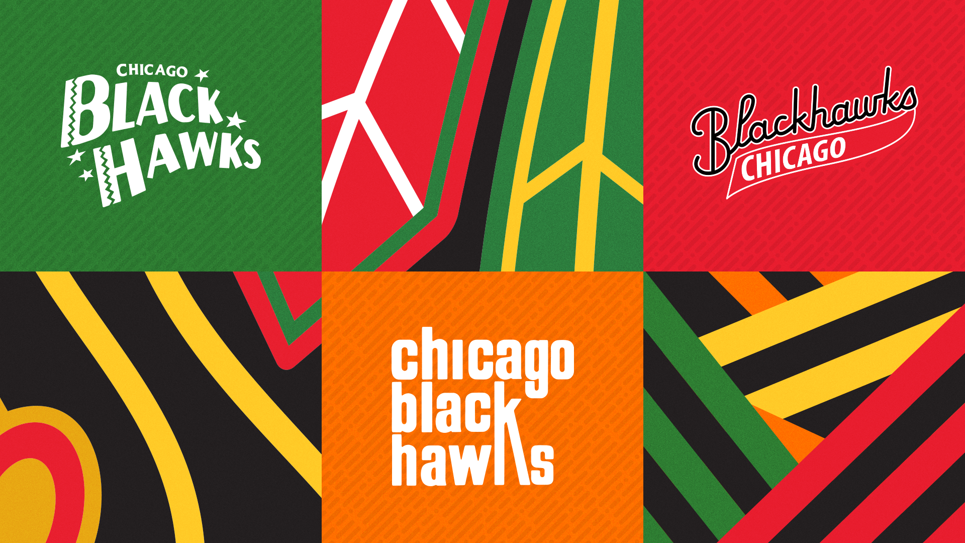
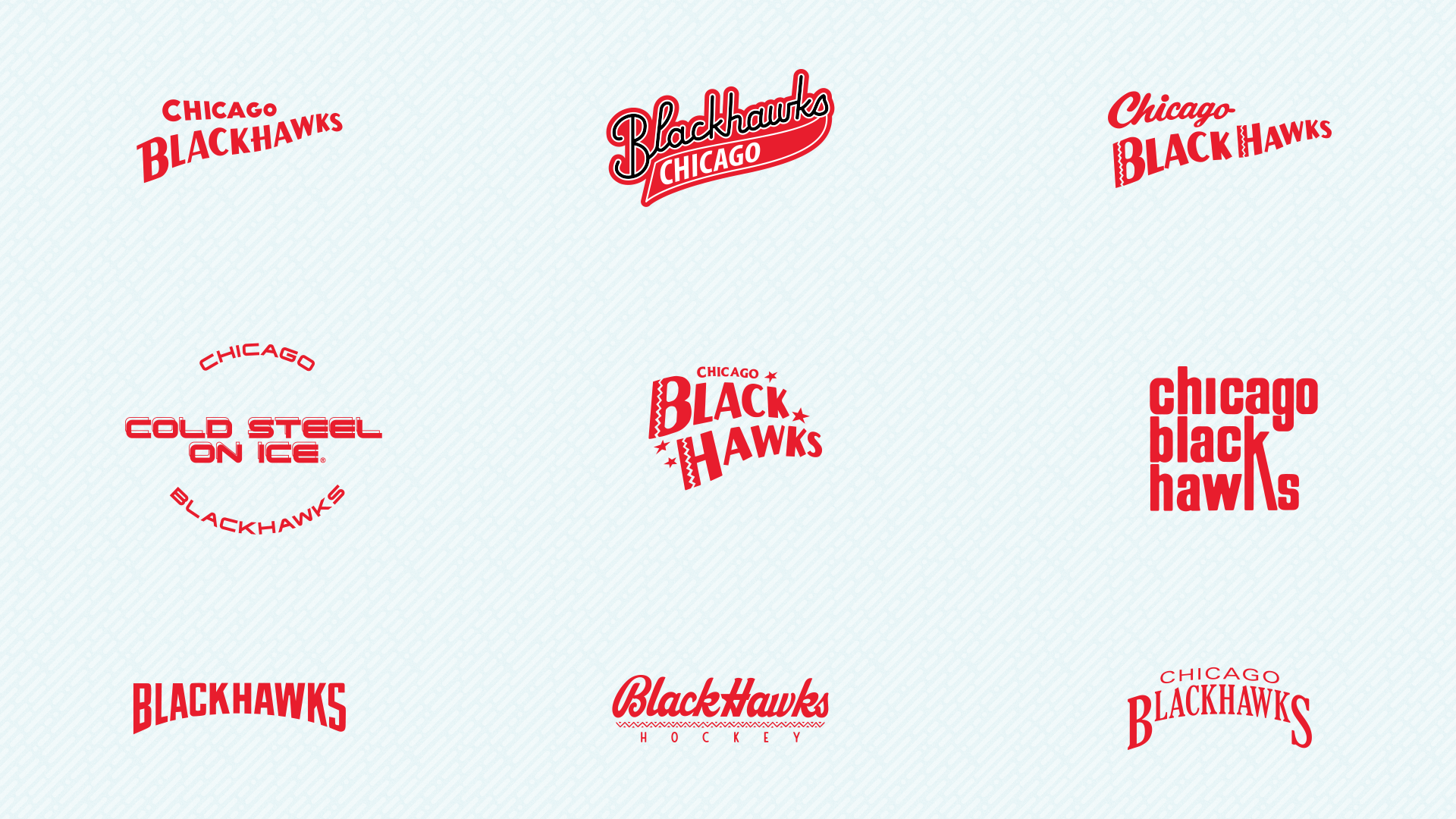
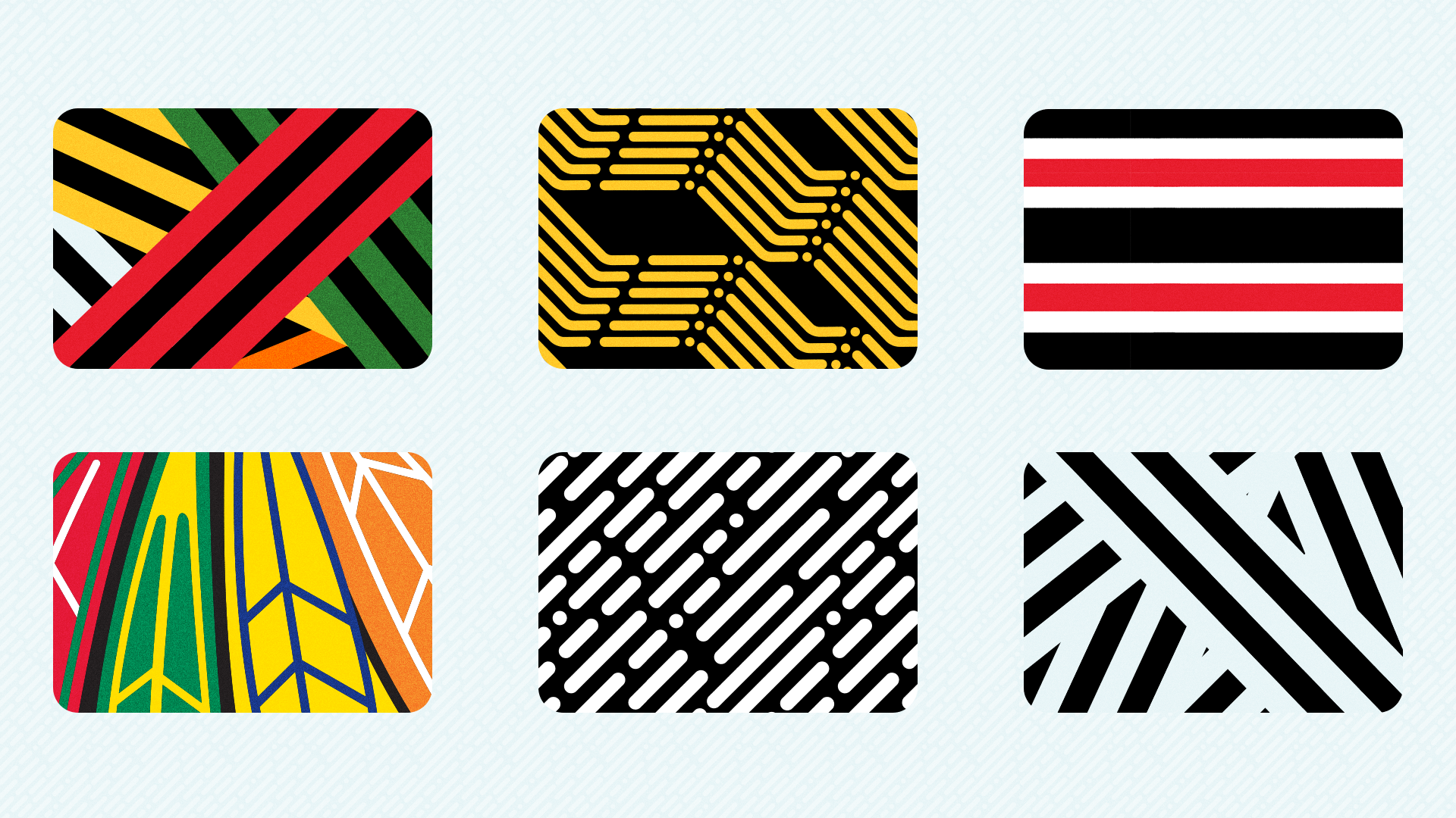
The 2020-22 brand identity is inspired by the look of the original team sweater, as it was considered flashy and colorful at the time. It was trailblazing; a bastion of style and originality in the early part of the 20th century. This direction marries the honor of heritage that lives outside of the logo with clean, modern geometric shapes and graphic color-blocking. This look made a mark in an understated way.
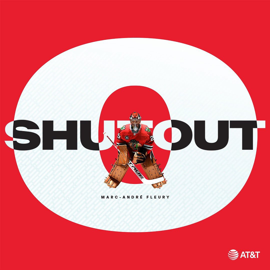
Coupled with bold calls to action and an updated refresh of the traditional Blackhawks palette, this look became a visual rally cry. The energy in large, short bursts of type harken back to event posters, reminding us of connection and the magic of live entertainment.
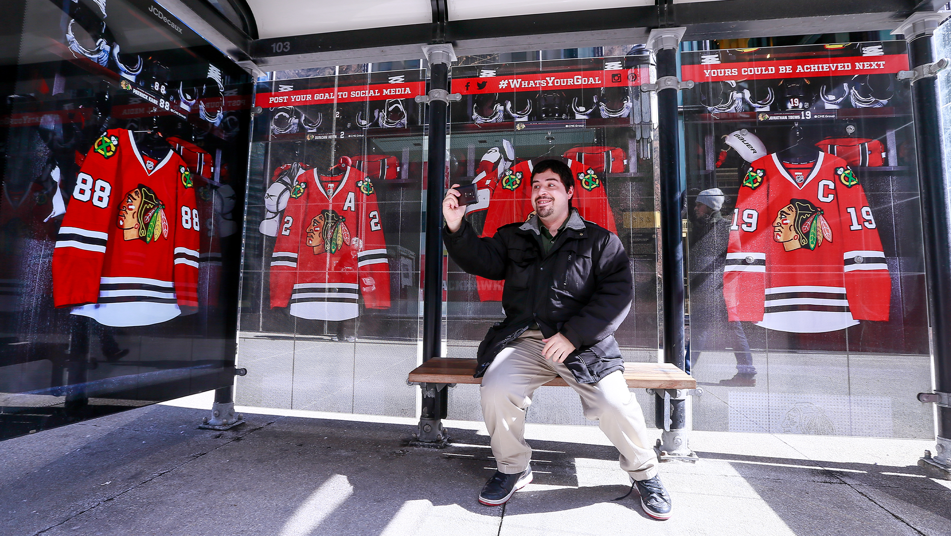
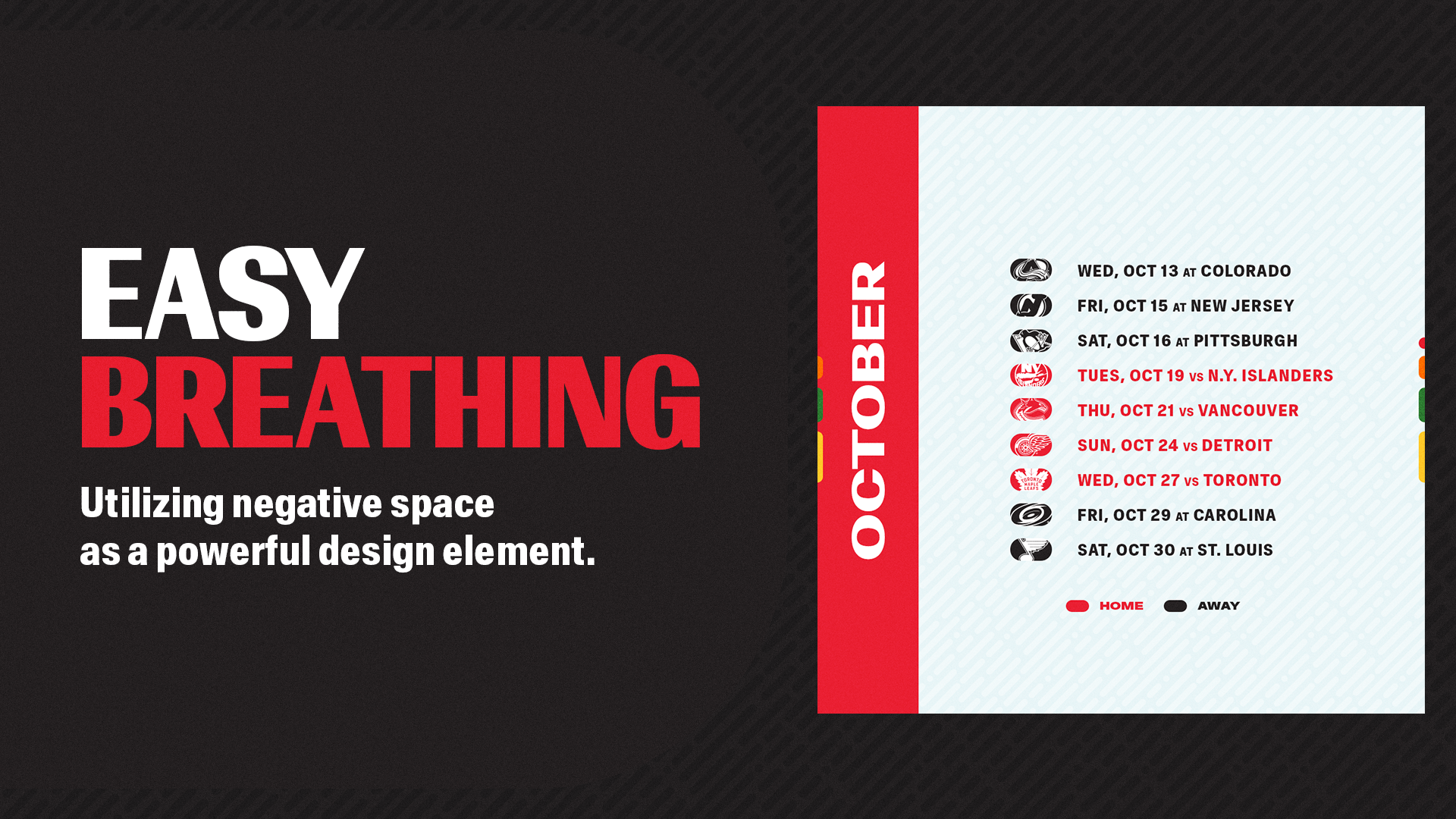
A stripped down approach provided space; what is not shown is just as important as what is. Clean lines became open-ended invitations, welcoming all audiences in the community to find their place within the elements.

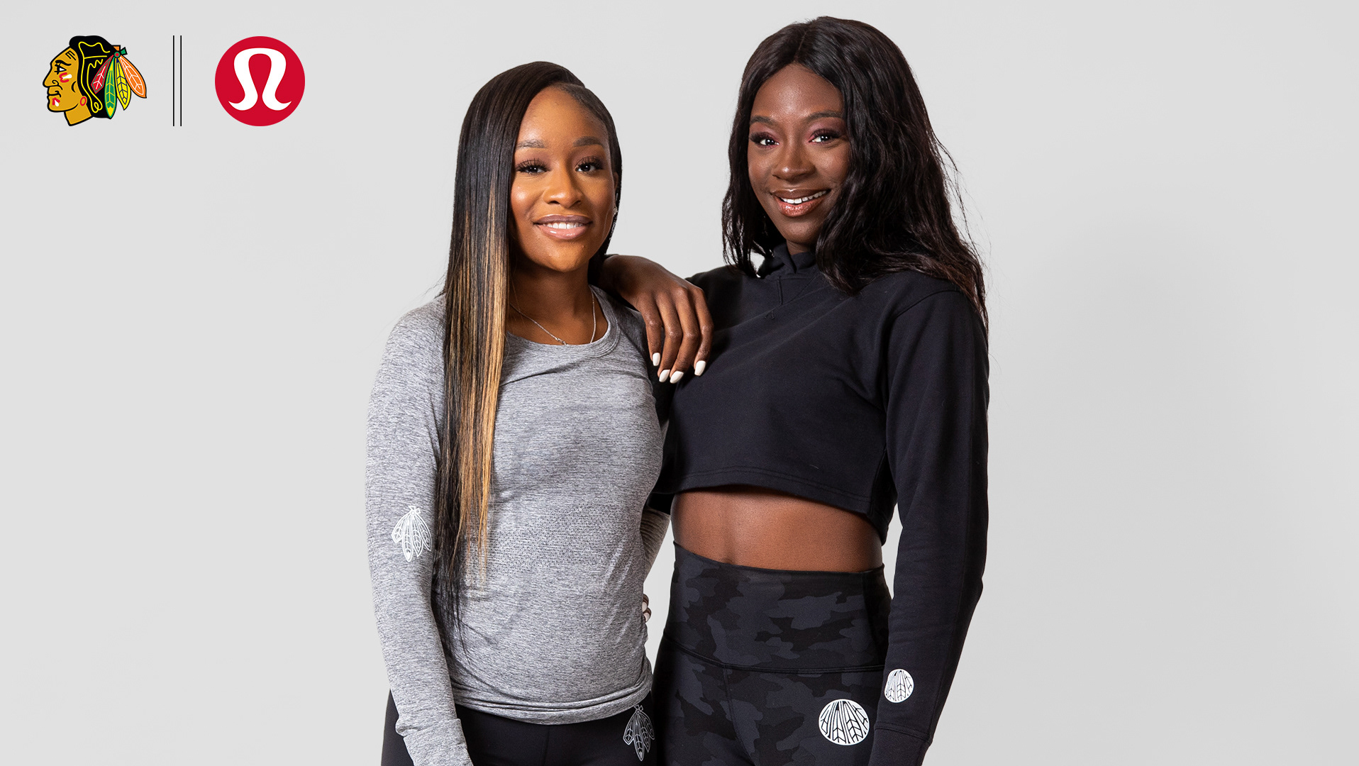
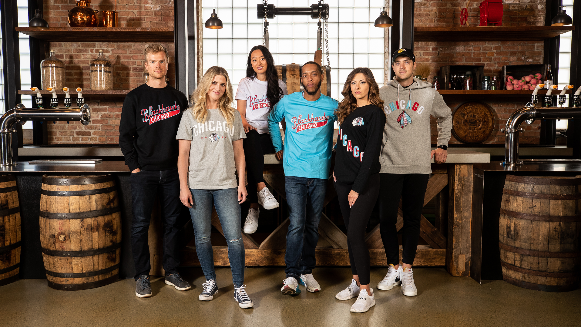
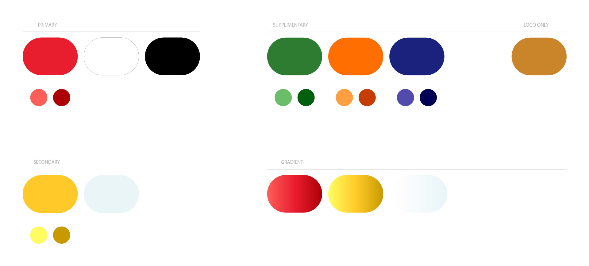
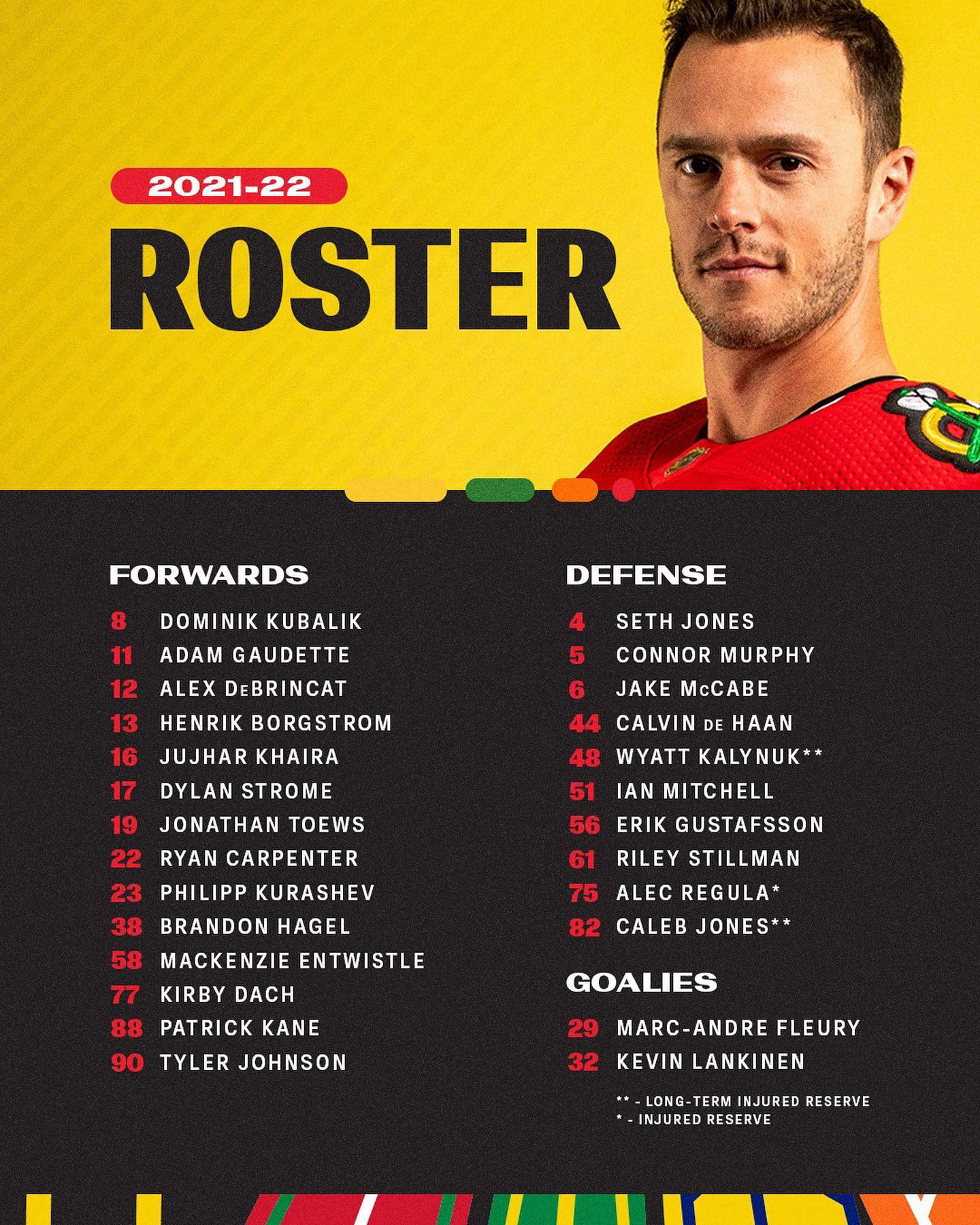
The evolution of the Blackhawks brand and its color use was more about celebration than change. Implementing all colors from the palette throughout deliverables, with restraint and hierarchy in mind, drew a stronger connection to both the core logo and the renewed sense of vibrancy surrounding the brand. The digital swatches and formulas were slightly updated for more high-fidelity screens, to have more precise harmony with one another, and in accordance with standards set by Google Material Design.
The lighter and darker shades presented with the core colors were utilized for specific executions that required multiple shades of one color, while still adhering to the brand specific tonality.
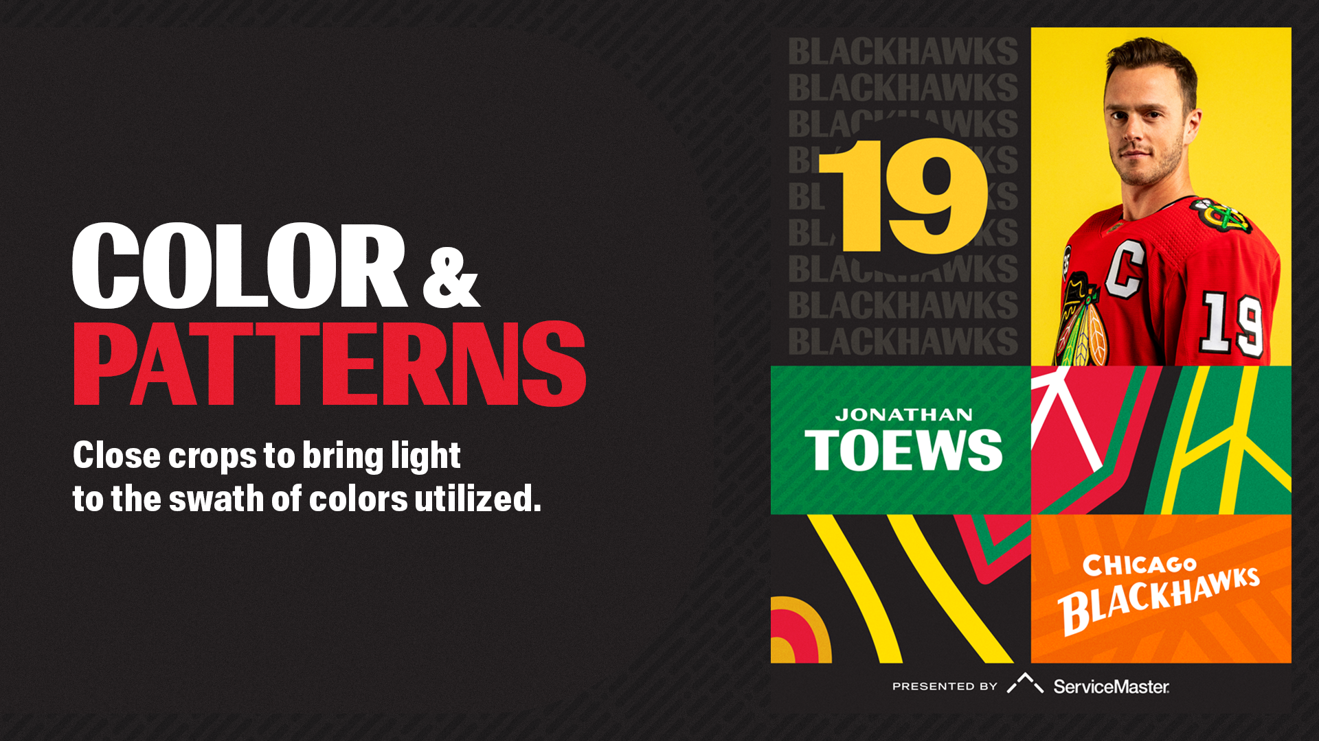
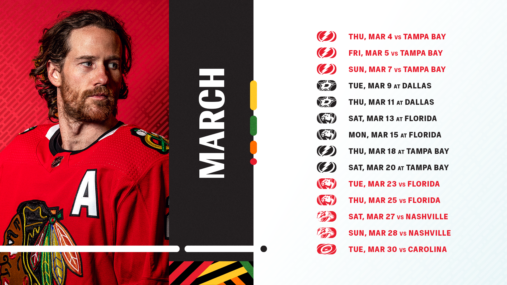
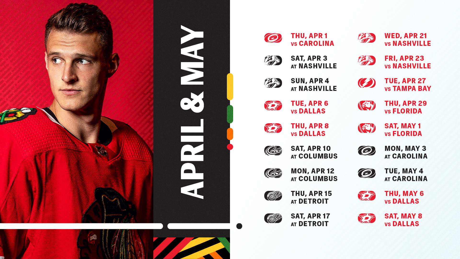
To achieve consistent and exceptional creative output throughout all organizational branding, marketing, and digital media campaigns, a 6x6 grid system was implemented. Inspired by the Blackhawks uniforms, it allowed for all content to have a home in a dynamic fashion, while still clean. The principles of the grid system also allowed for ease of implementation across all deliverables.


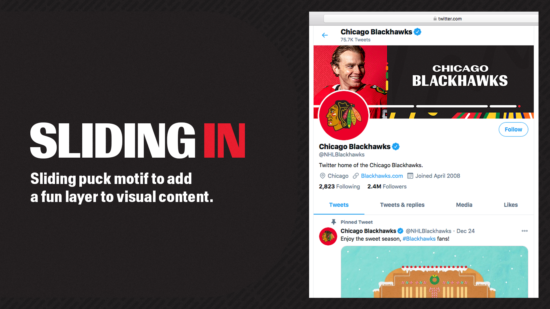
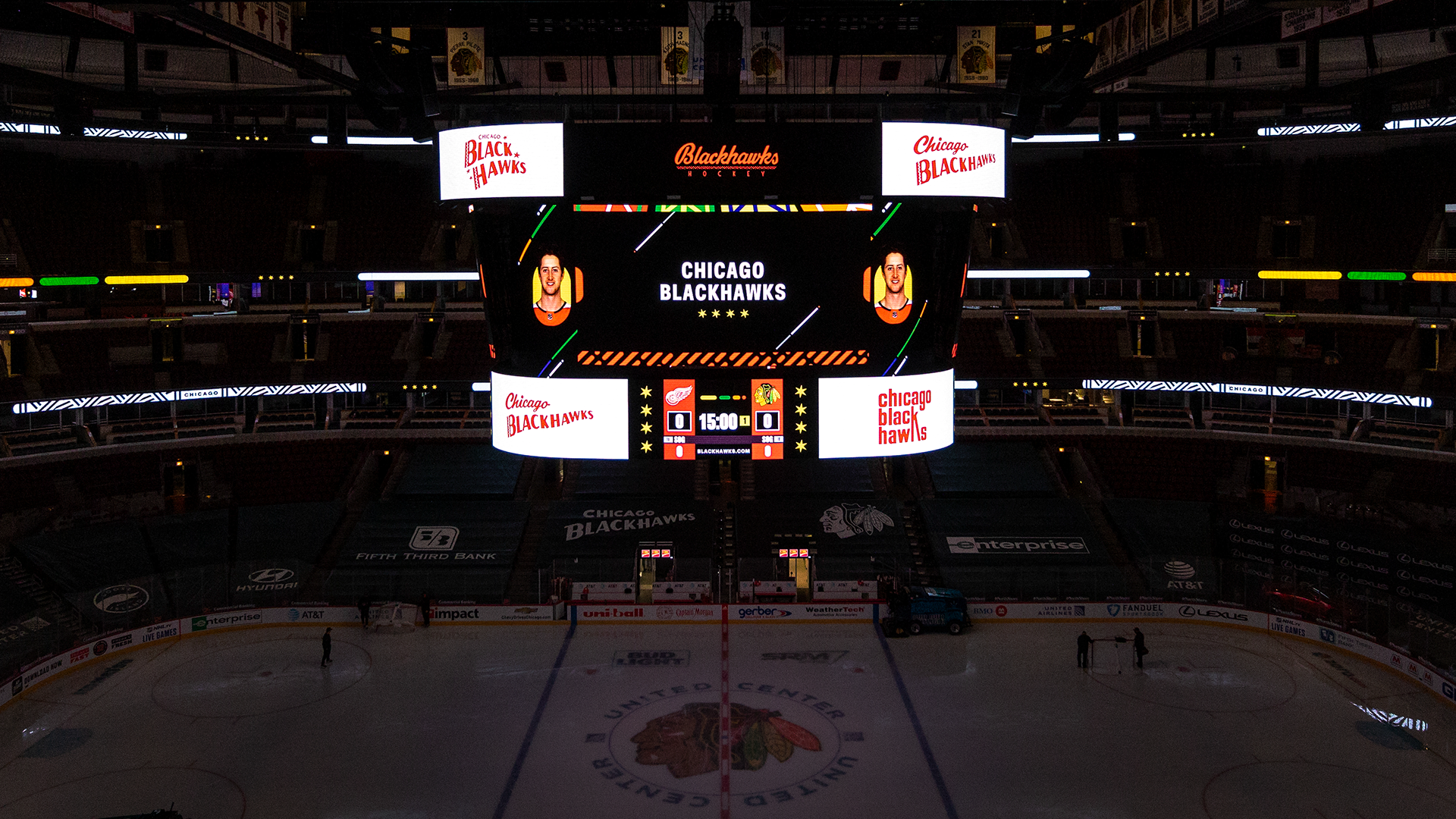
Elements from the brand identity came to life when Blackhawks Creative collaborated with the United Center Scoreboard Operations team, as the sliding puck motif, vintage brand marks, and jersey stripes created a strong visual impact during Blackhawks home games.
CREDITS
Creative Director: John Sandberg
Design: Sean Grady, Missy Wilson, Kellie Fredette, Jack Gambro
Additional Identity Design: Jordan Smith, Kim O'Reilly
Photography: Chase Agnello-Dean, Adam Eberhardt
Video Production: Banner Collective
In-Arena Production: United Center Scoreboard Operations